

Interiors Trends for 2021 | Illuminate your life
For the first time ever in their twenty-year history of naming a ‘Colour of the Year’ Pantone decided to release two colours in tandem for 2021: Illuminating Yellow and Ultimate Gray.
It’s a decision that has been met with mixed reactions. Vogue described the choice as ‘Really Weird’ whilst the usual social media based keyboard warriors compared the colours to “double yellow lines on concrete” or “hi-vis workmen gear”.
The truth is though that these two colours are a great combination for any modern home where you want to bring in elements of optimism offset by cooler hues.
According to Pantone themselves the two independent colours, “highlight how different elements come together to support one another… practical and rock solid, but at the same time, warming and optimistic, the union Ultimate Gray and Illuminating is one of strength and positivity.”
When it comes to trends in the home Pantone couldn’t really be more spot on when it comes to ‘Ultimate Gray’ (or Grey if you’re British). Grey is a shade which isn’t going anywhere when it comes to upholstery, carpeting or any soft furnishings for the home. Over the last 5 years grey has become the safe ‘go to’ neutral choice for most homeowners overtaking cream and beige tones. That doesn’t mean grey has to be boring though.
It provides the perfect backdrop to be more experimental with colourful pieces of art and bolder fabric choices. Mid grey carpeting or kitchen cupboards lend themselves to statement turquoise wall tiles or splashes of pinks and blues which equally sit at home next to it.
And ‘Ultimate Gray’ to all intents and purposes is a shade which positions itself around Farrow & Ball’s Pavilion and Lamp Room Grey tones which prove perennially popular with many home owners looking to make a sophisticated, livable interior scheme for their homes.
Yet painting anything in your home grey has many design snobs rolling their eyes and exclaiming ‘how obvious and unimaginative.’ Which is why showcasing grey alongside a bright, fresh tone like Illuminating Yellow really helps to capture how aesthetically pleasing many colours look alongside a mid-grey palette. It really is the comedy straight man or stooge to the main event.
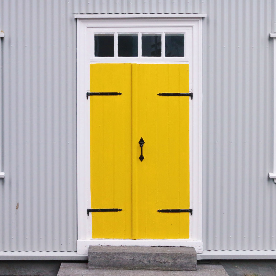
Because yellow next to grey just works. It’s basically sun peeking through the clouds and like many colour combinations that find their roots in nature it feels cohesive and instinctive.
Bright yellow and mustard fabrics against grey marble and stone flooring or walls is an instantly glamorous combination. Chic and sophisticated the obvious warmth given from yellow tones stops natural stone elements feeling too cold and drab.

Yellow fabrics and grey marble – a perfect pairing
Photo by Bogomil Mihaylov on Unsplash
The Alexander & James Sofia Chair in Plush Turmeric photographed against a backdrop of mid grey with accents of blue and chair in a patterned contrast is a perfect example of how yellow and grey work in harmony together and allow other elements breathing space to find their moment.

The Alexander & James Sofia Chair in Plush Tumeric
So if you’re looking to add a touch of colour ready for Spring then this years Pantone combination is a stylish yet safe bet. When it comes to the trend setters and neigh Sayers sometimes when it comes to colour its best to just go with what personally makes you smile – and whilst we’re experiencing the depths of a Siberian snow flurries in the UK this February anything that evokes thoughts of sunnier climes is sure to do just that.
Written by Luke O’ Neil
Head of Marketing , Ponsford
Top photo feature by Garrett Sears on Unsplash